cine.viz
Cinematic Visualizations
This is an evolving set of visualization work related to moving images, whether film, television, or other video. The scope is intentionally loose and inclusive, with examples of story flows, ways to see time, insights into the business and art sides of movies and TV, popular actors, editing metrics, and more. As well, the images range from hand drawn sketches to polished graphics. I find these samples intriguing, both collectively and each in their own way. It is striking how the moving image inspires people to study and visualize it on so many levels like this.
The texts and images presented here are compiled from the pages of their authors, and copyrights for these elements reside with them.
Please contact me if you have something to suggest adding.
In no particular order (yet), please enjoy...
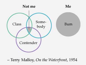
Persol Magnificent Obsessions: 30 Stories of Craftsmanship in Film (2012)
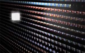
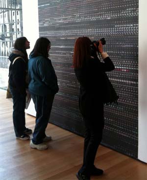
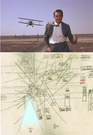 This blog entry touts an exhibit at the Museum of the Moving Image, and dishes up this image, "A scene from North by Northwest juxtaposed with Alfred Hitchcock's illuminated camera diagram."
xkcd
Movie Narrative Charts
 Randall Munroe's Movie Narrative Charts are beautiful hand-drawn movie timelines.
Also check out Vadim Ogievetsky's PlotWeaver, which attempts to automate the generation of visualizations like xkcd's.
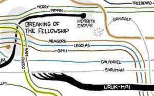
The Fellowship (2011)
 Middle Earth is, indeed, central.
Video Streamer (1992)
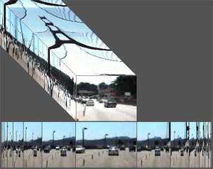 Video Streamer shows the flow of time by stacking frame upon frame on a T-axis, forming a volume of video.
Slit-scan effects emerge on the side, revealing temporal details, like camera zooms and cuts in editing. The edge of a view can be quite revealing.
My master's thesis, which spawned the streamer.
movie core (2010)
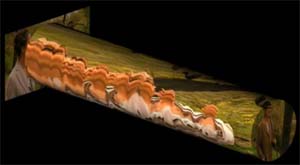 Moviecore takes a cylindrical sample of movie time.
An Informal Catalogue of Slit-Scan Video Artworks and Research (since 2005)
 Golan Levin offers a compendium of slit scan creations, often swirling views of time.
2001 A Space Odyssey: Unwrapping the Slit Scan sequences
 Ercolano maps the trippy slit scan sequences near the tail of 2001 A Space Odyssey back to the original artwork.
Now I am curious what a video streamer view of 2001 would look like.
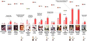
THE LAST EMPEROR (2011)
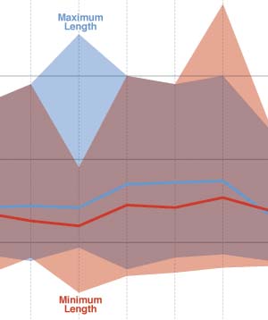 Dorothy Gambrell charts minimum, median, and maximum movie lengths over time for Academy Award best picture nominees and for top ten highest grossing films in the US.
_Christopher Lloyd: Disheveled Hair vs. Awesomeness
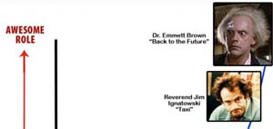 This plot of images on the kinda shitty to awesome role and shaved to disheveled scales plots a Christopher Lloyd curve...
from Uncle Fester (shaved and shitty)
to Dr. Emmett Brown (disheveled and awesome).
Fluid Guide (2012)
 A carpet controlled electronic program guide (EPG).
Also see Movies & Magnets, by Boertjes.
Pulp Fiction chronological sequence
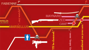 Dehahs says he was inspired by xkcd's movie narrative charts.
Pulp Fiction in Chronological Order
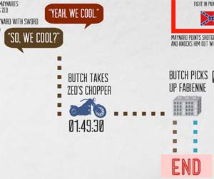 Another crafty Pulp Fiction timeline.
Movie Tagger Alpha (2010)
 What can happen when movies and TV shows are tagged, down to the second, both objectively and subjectively? RCDb and USC's School of Cinematic Arts combined efforts to begin to sort that out.
Bluefin Labs (2011)
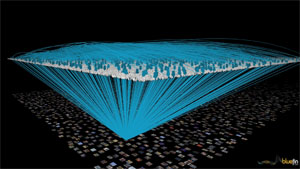 Bluefin Labs uses social TV analytics to gain insight into viewer thinking. They mine Twitter and others to learn viewer reactions.
Check out Bluefin's visualizations of moving image metadata and Deb Roy's TED talk: The birth of a word.
Famous Movie Quotes (2010)
 Nathan's words: "Here's looking at you, data point."
Famous Movie Quotes, part 2
The Top 50 Highest Grossing Movies: Famous Quotes
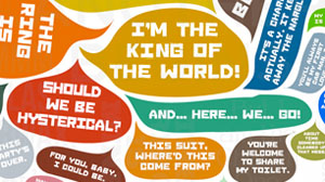 A splash of movie quotes, in speech bubbles.
Purportedly, quotes from "the top 50 highest grossing films of all time".
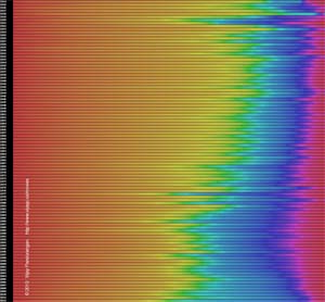
Cinemetrics (2011)
 See Frederic Brodbeck's project for a pulsating view of cinematic pacing and color schemes.
An earlier project named Cinemetrics.
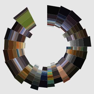
Colours in Movie Posters Since 1914 (2012)
 The evolution of colors used in movie posters. Also see Lesley Yarbrough's color-passioned comments on Pandurangan's work.
Which of These 13 Most Popular Movie Poster Trends is Your Favorite and Least Favorite? (2011)
 Ever walk away from a movie feeling like it was pretty predictable? Are movie posters often just as formulaic?
More cliches, and more.
Also see Trajan is the Movie Font.
Orange/Blue Contrast in Movie Posters (2009)
 Is there an excessive use of orange/blue contrast in movie posters? Now, will you see it always?
Just for kicks, Google up movie poster to see what compositions and color schemes in one ad hoc view of poster trends.
The 14 movies by the Coen brothers (2010)
 McDormand, Goodman, and Buscemi perform a lot for the Coens.
Their tomatoes are consistently high, well, except for Hudsucker Proxy and Ladykillers. C'mon people, it's for kids.
I wish my brother and I could merit one 23rd as many oscars.
The Coenfographic (2011)
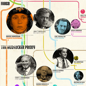 "Charts the films of the Coen Brothers from Blood Simple to True Grit and maps out the most prevailing actors throughout the years by film"
6 Degrees of Kevin Bacon Tech Edition
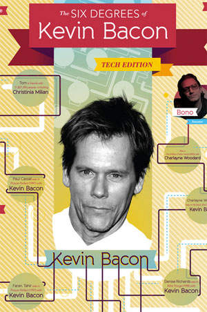 A short list of Kevin Bacon links. Check with the Oracle of Bacon, and People with Bacon Numbers.
I once stood in line behind Kevin Bacon at a rental car counter. How does that affect my Bacon Number?
??? (2011)
 A Kevin Bacon social graph.
Why the red and blue boxes and arrows?
Time Data (2011)
 RCDb (now Watchwith) is collecting very detailed metadata for thousands of movies and TV shows, timed to the second. I had the pleasure of producing images ranging from sub-second, to whole film, to thousands of films, ranging from static to animated to interactive. Such fun!
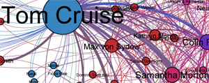
Moviegalaxies (2012)
 Social network diagrams of movies, based on relationships sussed from movie scripts.
Movies & Magnets (2012)
 This movie data explorer uses the metaphor of draggable and tweakable data-magnets to control a force-directed layout of movie posters and their associated information.
Also see Fluid Guide, by Boertjes.
Liveplasma (2004)
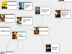 Liveplasma is a graphical interface for discovering music, movies, and books related to a title of interest. For City of God, Amores Perros makes sense, but Conan the Barbarian?
The Top Grossing Film of All Time, 1 x 1 (2000)
 Jason Salavon visualizes Titanic by boiling the color of each frame of the film down to a single pixel.
 It is not clear what technique was used for MovieBarcodes, but the results look similar to Jason Salavon's, just rotated 90 degrees.
BLADE RUNNER revisited >3.6 gigapixels (2010)
 Blade Runner, big, very big.
CINEMA REDUX (2004)
 Film frames, at one second intervals.
Reminiscent of similar work at the MIT Media Lab's Visual Language Workshop in the early 90s.
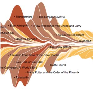
Movie Charts
 Zach Beane's MovieCharts render movie gross information from Box Office Mojo in a flowing fashion.
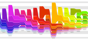
The Ebb and Flow of Movies: Box Office Receipts 1986 - 2008 (2008)
 The New York Times team employed a streamgraph view to show box office performance over time.
Spotlight on movie profitability (2012)
 Compares budget and worldwide gross for movies in various genres from 2007 to 2011.
Hollywood Data Exploreer (2012)
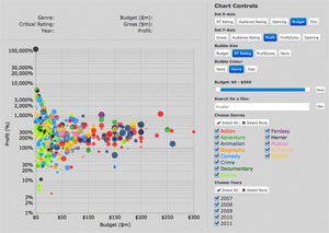 Which movie had a greater return on investment, Avatar or Juno?
This delightfully tweakable scatterplot of movie data from 2007 to 2011 makes it easy to compare numerous attributes across hundreds of movies.
Rating Profitability Over Time (2011?)
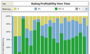 What tends to be more profitable, a PG-13 rating, or R?
What do producers prefer?
The Biggest Summer Blockbusters of All Time (2010)
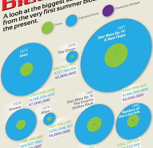 It's not clear what the data sources are, but this infographic compares budget, gross, and adjusted gross (presumably for inflation) for 35 summer blockbusters, from Jaws in 1975 to Spider-Man 3 in 2007.
Any trends? Maybe that budgets are swiftly growing in recent (should have been adjusted too), and that margins are shrinking?
What does that mean?
Increasing action and polish make for less profit?
Adventure productions are increasingly less adventurous?
Focus on purple to green ratios here for hints at production costs versus popularity.
Hollywood Budgets
 2007 to 2011
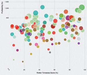
Compares profit with Rotten Tomatoes score and critics score for hundreds of films, categorized by 22 story types.
Shooting Stars! (2012)
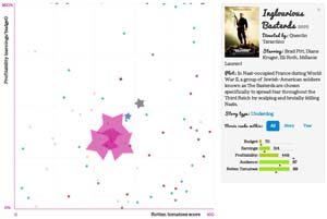 "Turns out that the most frequently used story types are far from being the most profitable!"
Dancing Plague of 1518 (2012)
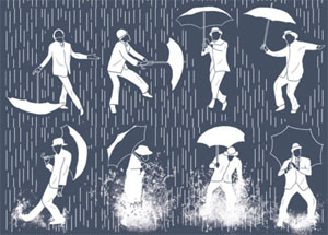 Let's do the Time Warp Dance,
or let's vote for Pedro,
or let's just sing in the rain.
Batman Icon's Mutation 2.0 (2008)
Batman Physics (2012)
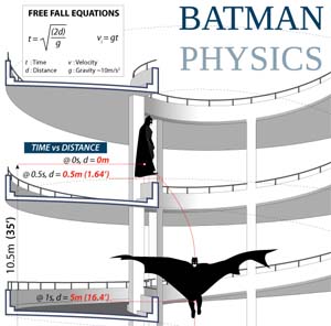 Illustrated equations of free fall.
Also see Murderous Physics.
Taste Visualization for Pixar's Ratatouille (2007)
 This one is quite interesting. Michel Gagne was asked to sketch visuals to represent the sensations of taste and smell. Those were then used to inspire the musical score. Finally, all were combined in the film.
Movie Monster Infographic
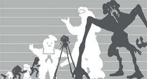 What's bigger than Godzilla?
100 Pixar Characters Size Comparison (2010)
 Heights of Pixar characters, from Wally B to Twitch.
Kinetic Typography: Fight Club on the scene "Chemical Burn" (2010)
 The script of Fight Club's "chemical burn" scene in animated type.
Fight Club
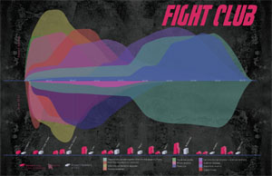 Timeline graph of event intensities. Also charts product placement.
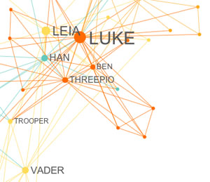
How Star Wars Changed the World (2011)
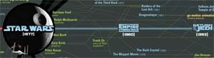 This talent explosion chart plots key people who contributed to the saga, and other films they worked on.
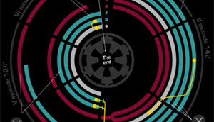
Star Wars: Episode IV retold in iconoscope
Star Wars Facts
 Five infographics in one, including a plot overview, a budget and revenue timeline, a chart of total ticket sales across days of release, a graph of character appearances across all six episodes, and other numeric trivia.
Star Wars Infographic of Revenue Throughout the Galaxy (2012)
 The "bar chart" is bogus, but the Millennium Falcon pie-like chart might be fairly accurate.
Judge for yourself.
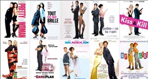
JOEY WHAT HAPPENED JOEY (2012)
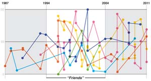 Some had film careers before Friends, and most do after. Then, there is Joey.
BUT FOR THE GRACE OF TOY STORY(S) (2011)
 Dorothy Gambrell charts Tomatometer ratings from Rotten Tomatoes for six decades of top grossing films.
Shot Logger
 Jeremy Butler's Shot Logger contains a database of shot lengths for over 600 films and TV episodes.
A Shot Logger tidbit: average length of all shots = 6.33 seconds.
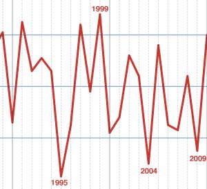
Cinemetrics
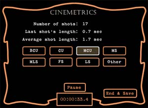 Yuri Tsivian also looks at shot lengths and offers a database of shot timing in his Cinemetrics project.
Visualizing Temporal Patterns in Visual Media
 Lev Manovich and Jeremy Douglass discuss visualizing time in a variety of visual media. Regarding film in particular, they note how shot lengths have generally trended lower over the past century.
Software Studies Initiative
 Lev Manovich directs the Software Studies Initiative at UCSD, exploring the field of digital humanities, including analysis of video.
Cultural_Analytics (2012)
 Cultural Analytics, coined by Lev Manvich poses the question:
How and why study big cultural data?.
Is Jeff Bridges most likely to win best actor? (2010)
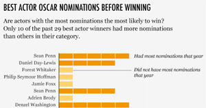 10 of 29 best actor winners had more nominations than others in their category for the Oscars. Do nomination counts count?
The Definitive Meryl Streep Matrix (2012)
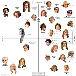 Eliot Glazer plots Meryl Streep's roles on two axes: cold - warm, and frivolous - serious. It might be interesting to see a graphical indication of release year on this Streep-head scatterplot to see if there is any pattern to the types of characters she plays over the progression of her career.
DVD Rental Revenue 2001-2008 (2010)
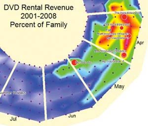 DVD rentals from 2001 through 2008 charted on a spiral.
Where is Everyone? (2009)
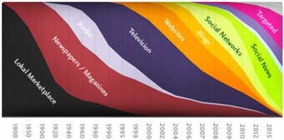 In understandably broad strokes, Where is Everyone? paints a picture of the progression of media types, suggesting each grows, flourishes, then yields to others. However, the absence of movies stands out. Maybe they are more constant than other media?
U.S.A. Sitcom Map (2009)
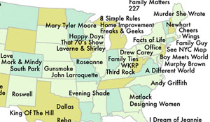 Offhand, it looks like the greatest concentration of settings of popular sitcoms is in Los Angeles. Many were, perhaps, conveniently shot near there?
Dan Meth's NYC Sitcom Map.
Film Map (2012)
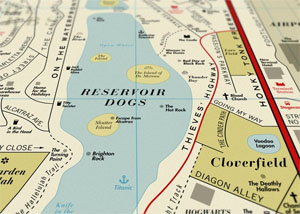 A map made up entirely from film titles.
US Movie Map (2012)
 There it is, SLC Punk makes Utah.
Compare with this.
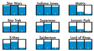
Rambo Kills (2012)
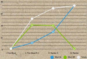 The number of bad guys killed by Rambo in parts I, II, III, and IV.
The "Memento" Timeline, Visualized
 Now + flash back + flash forward, a time machine.
What movie should we watch tonight?
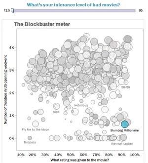 Counts of opening theaters versus ratings (data sources?)
As course as it is, any insightful patterns to discover with the side controls?
The Christopher Nolan Flowchart: What movie are you watching? (2010)
 How many films has Christopher Nolan directed? Which were they?
Have you watched one recently?
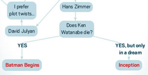
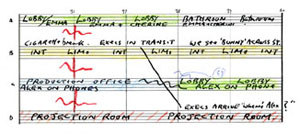
Christopher Nolan's Inception Flowchart (2010)
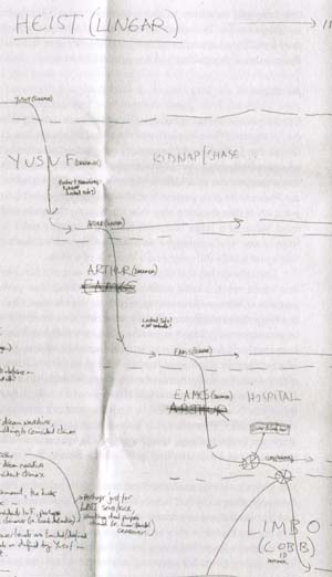 How Christopher Nolan, himself, charted Inception in a sketch.
coming up.., several variations
read on, dear reader
I'm getting sleepy
very sleepy
kick?
Inception Explained
 Scrollable storyline of Inception.
Inception Poster/Infographic (2010)
 Reality, dreams, Limbo.
INCEPTION FOR DUMMIES (2010)
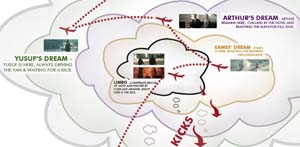 Cloudy dream diagram.
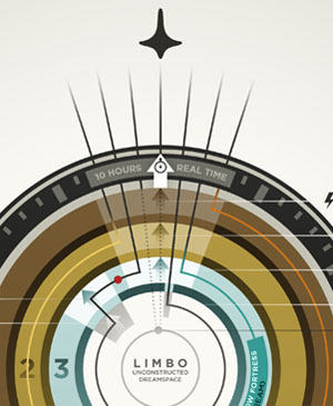
Inception Infographic (2010)
 Indicates how perception of time slows down with dream depths.
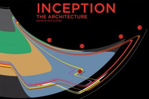
I am the architect (2010)
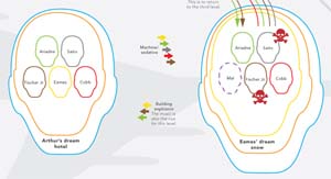 Heads in heads, in heads...
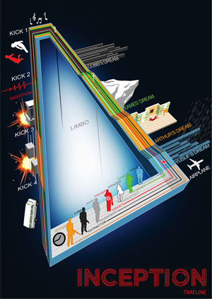
Inception Timeline Visualisation (2010)
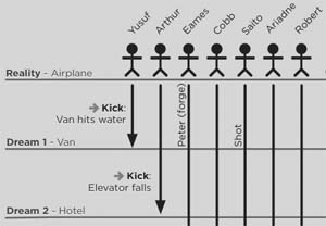 Seven stick figures hop on a plane, some snooze, four reach Limbo.
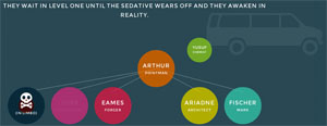
An Illustrated Guide To The 5 Levels Of Inception (2010)
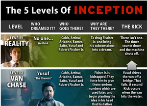 Levels, who dreamed, who goes, and why, plus the kick back up, all in colors, faces, and text.
Inception Infographic (2010)
 Dreams, with kicks.
Inception infographic (2010)
 Injury and death charted across dream levels.
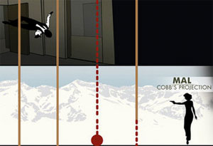
Inception infographic (2010)
 Rick Slusher graphs descent and ascent between reality, dreams, and Limbo, like many others (yes, including kicks), but also conveys how actual time compares to perceived time.
Napkin sketches leading to the design.
Inception explained for Mac users (2010)
 Nested dreams tucked in nested folders.
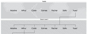
Inception Infographic (2010)
 Charts the paths of characters through the onion rings of dreams.
Inception: Perception of Time (2010)
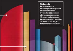 The Inception dream states as nested cylinders about a big Limbo core.
My Portuguese is weak, but here is a bit of a translation to English.
Pickup on a truck on a truck on a truck (2012)
 Now, to close off this riff of Inception graphics...
How do The Simpsons relate to Inception?
These reddit comments label this photo of nested trucks Truckception and refer to the truck-truck-truck in a Simpsons episode.
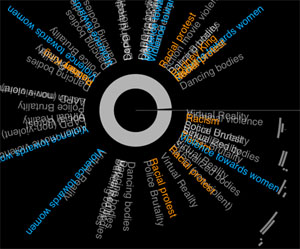
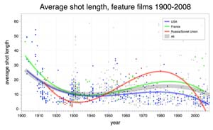
Film Patterns and Limits (2012)
 The authors studied the evolution of structure in films, looking at changes in shot length characteristics and visual activity over much of the 20th century. From research on film structure, it appears that Hollywood is becoming an increasingly better modulator of attention. The research is also giving new insight into the human visual system.
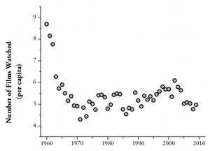
Visual Activity in Hollywood Film: 1935 to 2005 and Beyond (2011)
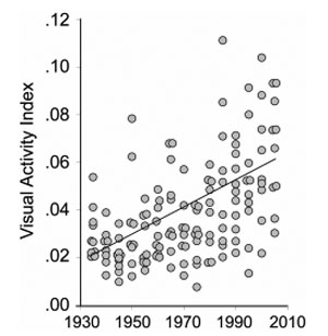 This study measured visual activity in 150 films from 1935 to 2005 and found that there has been a linear increase in this metric across many genres, but especially in action and adventure films.
Back to the Future trilogy timelines (2010)
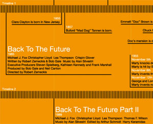 Sean Mort's Back to the Future chart correlates the trilogy of films, using eight timelines spanning 1850 to 2015.
Visual Evidence that Movies are Getting Worse (2012)
 A quote: "Opinions on sequels are almost always more divergent than the originals."
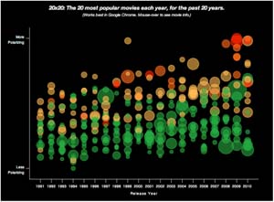
COMMODITIES (2011)
 Compares minimum, median, and maximum budgets since 1931 for top ten highest grossing films in the US and Academy Award best picture nominees.
I'm not sure if this is adjusted for inflation, but it costs so much to make a movie, especially since the late 80s! Are movies over-polished?
Pixar vs. DreamWorks Animation: Comparing the CGI Giants (2010)
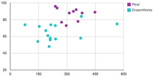 I don't know what a metascore is, but this article poses the question: "Is Pixar really the best computer animation studio?", and follows with discussion and graphs.
Bottom line, so far, looks like DreamWorks has grossed more (as of 2010), but Pixar has more good films.
Bottom bottom line, what is good or great for kid's eyes?
Timecode (2000)
 Timecode presented four cameras continuously following the interweaving of characters over the course of the film. There were no edits, just long simultaneous takes, kind of like recording a play on four side-by-side stages. Mike Figgis's background as a musician shows in "score" of the quad-split.
The full interview with Mike Figgis.
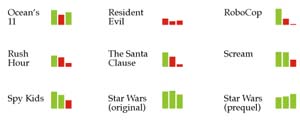
The Trilogy Meter (2009)
 Dan Meth graphed his own ratings of several trilogy films.
Do Movie Sequels Live Up to Their Originals? (2010)
 Nathan Yau looks at how sequels perform, based on Rotten Tomatoes ratings.
Bullitt - Car Chase Map (2007)
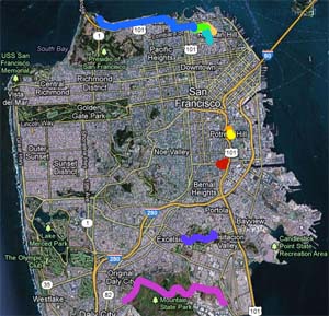 The car chase in Bullitt (1968) was shot in 9 different locations in San Francisco, some miles apart. Looks like Warner Bros. took down the chase video on Mike's page, but you can find it by searching "Bullitt car chase" at YouTube. Then see his nicely annotated Google map of the locations.
Movies with multiple Harry Potter wizards (2011)
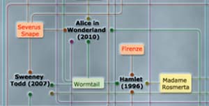 A social graph of movies with multiple actors who have played Harry Potter wizards, and the names of the wizards.
The 2011 Guide to Making People Feel Old - Using Movie Release Dates (2011)
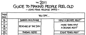 Did you realize that Home Alone came out more than twenty years ago?
Alien vs. Predator (2006)
 Visually compares ~50,000 Netflix customer ratings of Alien and Predator.
A Peek Into Netflix Queues (2010)
 The New York Times team maps Netflix rental patterns for a dozen cities. You can also roll over each zip code to see its most rented movies.
Why I want to quit cable (2012)
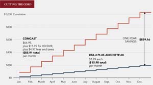 Nathan Yau debates his viewing habits and compares his cable costs with streaming alternatives.
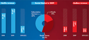
Movies & Shakers (2009)
 What does a movie cost these days? Which services are consumers using more frequently? Which companies are the most prevalent?
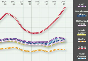
Head To Head: Netflix vs. Redbox (2010)
 Presents pros and cons of Netflix and Redbox, and compares their success.
Where are the biggest box office movies (not) streaming? (2012)
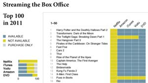 Nathan Yau graphs Tristan Louis's list of Where the hits are streaming in 2011.
Oscar Statistics: Money, Men, and Maturity; Plus Our Predictions (2011)
 William Briggs asks: Which is the better movie, the one awarded an Oscar for Best Picture or the Most Popular, defined as the one with that year's highest box office gross?
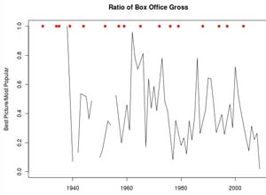
Overlap between Academy Award Nominees, Best Picture, and the Top Ten Highest Grossing Films per year, 1928-2010 (2011)
 How do Best Picture awards compare with box office popularity? Seems they used to have regular overlap, until the 1980s, and it has been sparse or non-existent since.
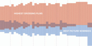
25 Highest Grossing Films of All Time (2008)
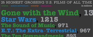 Quick, adjusted for inflation, which made more, Titanic or The Sound of Music? The Return of the Jedi, or The Empire Strikes Back? The Graduate, or The Godfather?
And... What is the most common genre among the 25 highest grossing, comedy, or animation? Action/adventure, or Drama?
GOODBYE TO DRAMA (2011)
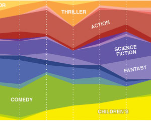 In terms of gross revenue, kid movies and fantasy are crowding out comedy and horror. Romance has been receding since the 40s. There was a surge of crime in the early 70s, and of horror in the late 70s. But, wow, drama ruled in early cinema, and barely exists now. Can that be right?
Slate's Hollywood Career-O-Matic (2011)
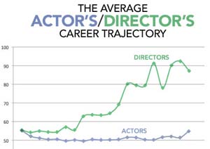 "What Rotten Tomatoes data tell us about the best, worst, and most bizarre Hollywood trajectories."
FilmStrips (2012)
 Seems to be gross over budget, across time, colored by genre.
Rolling your mouse over it yields info about genre, budget, gross, profit, and rating, for many recent films.
Among other things, it is interesting to sort by worldwide gross - gross above and budget below, then to plug in rating below.
I tried to track down the original author and source for each piece above. Please pardon, if I didn't dig far enough.