tinkering
Side projects present opportunities to play, that is, to explore creatively while learning new skills. Occasionally, they also provide a chance to work with friends on cool stuff. A few tinkering projects from my sandbox …
Flowing the Show
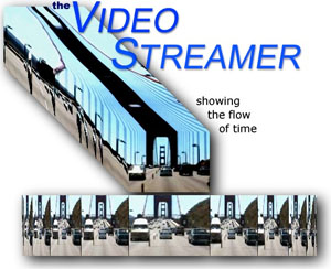
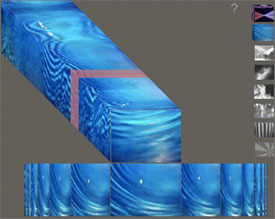
The Video Streamer presents video in an XYT space, stacking video frames along the T-axis (time) to produce a volume of video that reveals characteristics of time in a slit-scan fashion on its sides.
The streamer sprouted from my master's thesis at the MIT Media Lab's Interactive Cinema Group. It started as a video capture utility, but soon morphed into an interactive exhibit, which I have had the fortune of presenting internationally.
You can try a work-in-progress version with your webcam here (best in Chrome or Safari).
Cab Spots
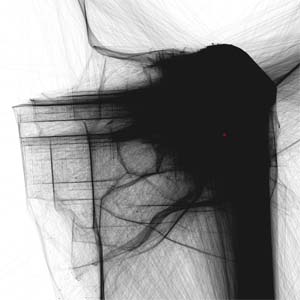
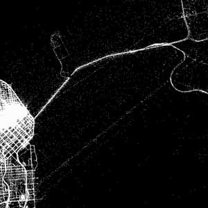
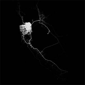
Stamen generously gave me access to their cabspotting dataset, which continually tracks the locations of hundreds of cabs in the San Francisco Yellow Cab fleet. I had immense fun figuring out various ways of filtering, analyzing, and rendering the data.
Cab-spots
Eric Rodenbeck's notes
on Cab-spots
Who Paid Them
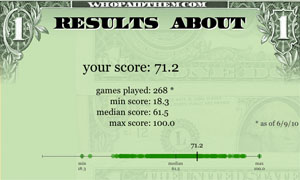
I collaborated with the amazing Matt McKenna to code up an online quiz for our entry in the Design for America contest conducted by Sunlight Labs. We were curious how perceptions of political funding compared with actual campaign contributions. We would love to find an opportunity to explore more how perceptions compare with reality.
Disney meets Darwin
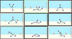
Can a funny walk develop through Darwinian evolution? Jeffrey Ventrella's 1994 Media Lab master's thesis, titled Disney meets Darwin : an evolution-based interface for exploration and design of expressive animated behavior, uses genetic algorithms to evolve animated behaviors. Jeffrey and I worked together in 2002 to produce an online version in Java that shows a population of stick figures evolving faster and faster walking capabilities.
Springs

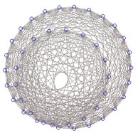
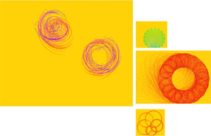

As an exercise for learning how to animate graphics in Java applets, I played with spring physics simulations. I ended up writing a small library that takes parameters to produce a range of animations using Hooke's Law and a Modified Euler integrator.
Flip Books
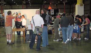
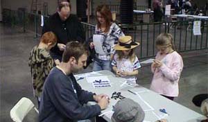
I set up a flip book assembly line at Maker Faire in 2008. In one weekend, with the help of my friends, Mark, Linda, and Michael, over 600 makers recorded, printed, and assembled custom flip books to take home. Even R2-D2 made a flip book.
America's Cup Race Data
The America's Cup World Series is a racing circuit taking place in numerous venues around the world
in preparation for the 2013 America's Cup. The ACWS visited San Diego in November of 2011 for a
series of match races and fleet races.
When I discovered that the America's Cup race data was publicly available, I became curious about synchronizing a rendering of a race with YouTube video of the race coverage. I started by plotting the paths of the nine race boats over the course of a fleet race in San Diego Harbor. So far, it looks like an elongated pile of spaghetti, but there some discernible patterns in the courses the racers took.
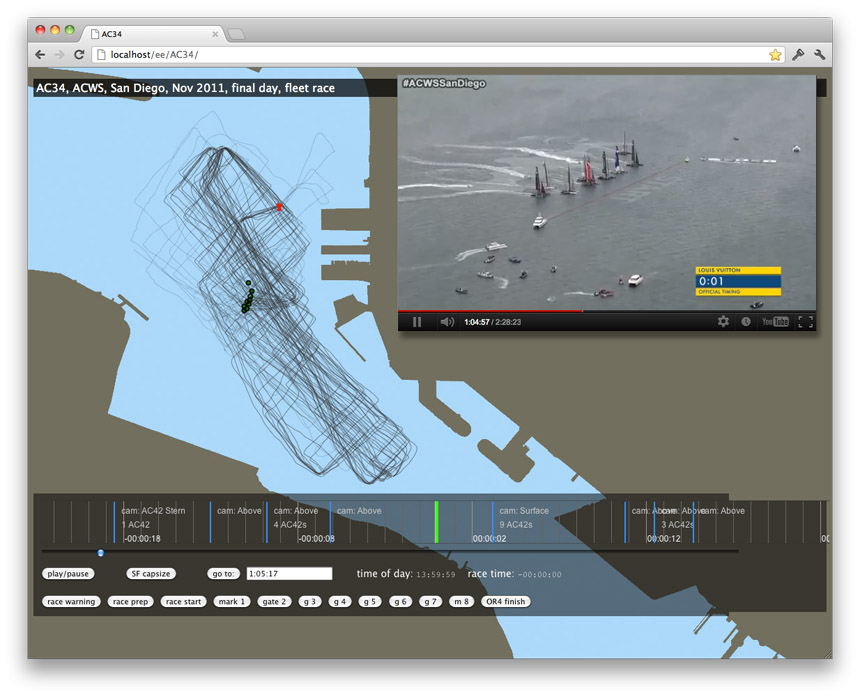
The data includes a sampling of each race boat's position, heading, speed, and other information five times a second. The video coverage is abundant, with four cameras on each of the nine race boats. Additionally, there are cameras on several chase boats, and on at least two helicopters.
The placement of the boats on their paths is synchronized in time to the race video. There is a race timeline that displays some timed metadata, such as which boats are in view in the video, and the position of the camera.
The remnants of the project are here. Alas, the YouTube video part is no longer behaving,
Human Development Report
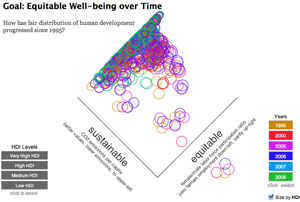
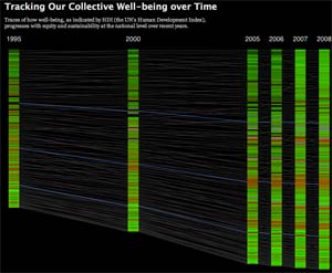
I had a modest entry in Visualizing.org's HDR 2011 Challenge, which provided data from the UN's annual Human Development Report. I used the exercise as a way to learn a little about Paper.js. The equitable well-being graph lets you look at how equitable and sustainable development balances out over time. The collective well-being graph shows how the Human Development Index of 174 countries progress over time.
